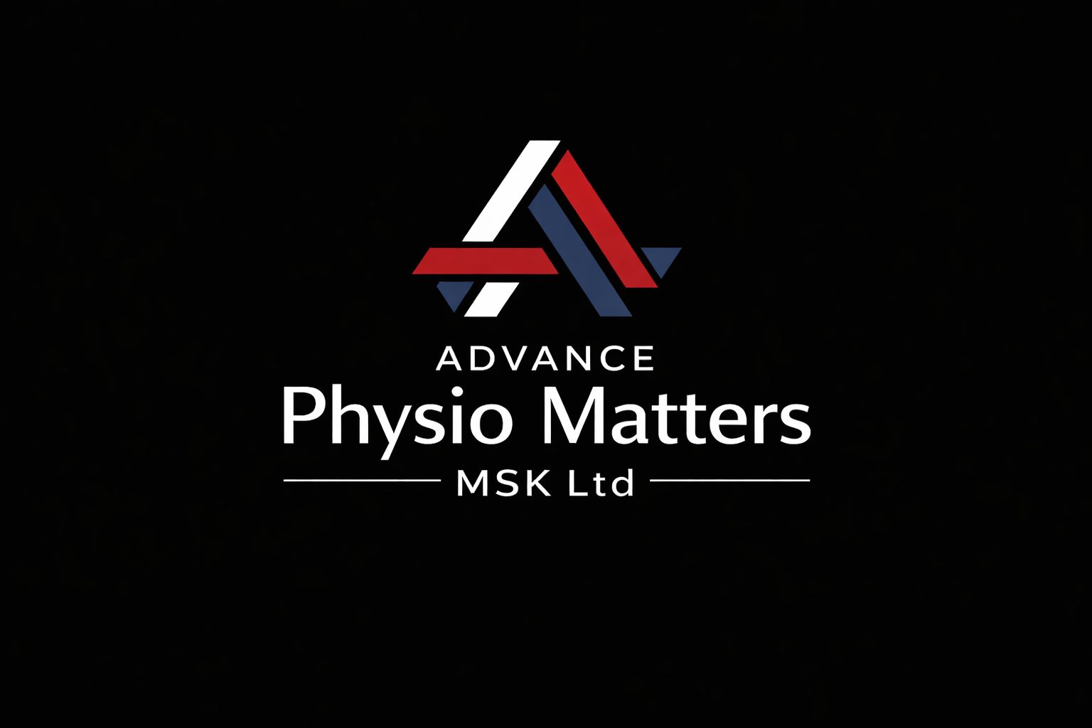
Advanced Physio Matters MSK LTD came through a recommendation with a specific brief: take an existing logo concept and make it work. The original mark had been AI-generated — over-complicated, multi-coloured and impossible to scale. The idea behind it was sound, an A-form lettermark with the suggestion of additional letterforms within it. The execution needed to start again from scratch.
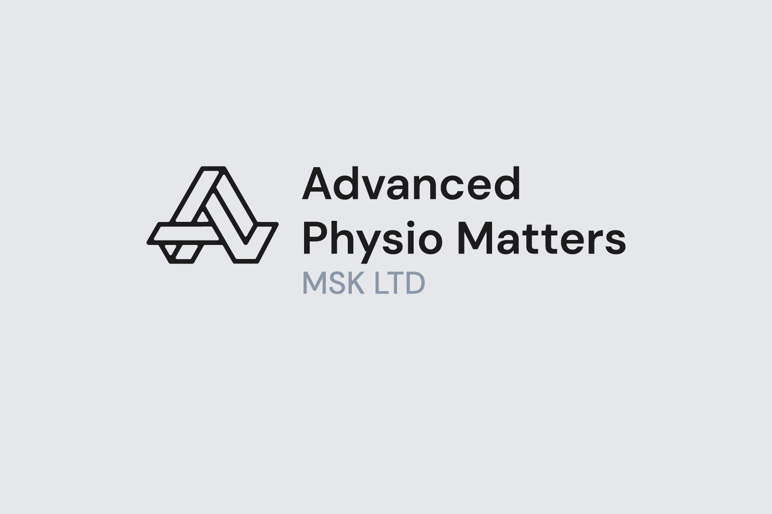
Working closely with the client throughout, I stripped the palette back to a single colour, simplified the mark and rebuilt it with purpose. The process was genuinely collaborative — they brought the ideas, I explained what would work, what wouldn't and why. The result keeps the spirit of the original concept while losing everything that was getting in the way of it.
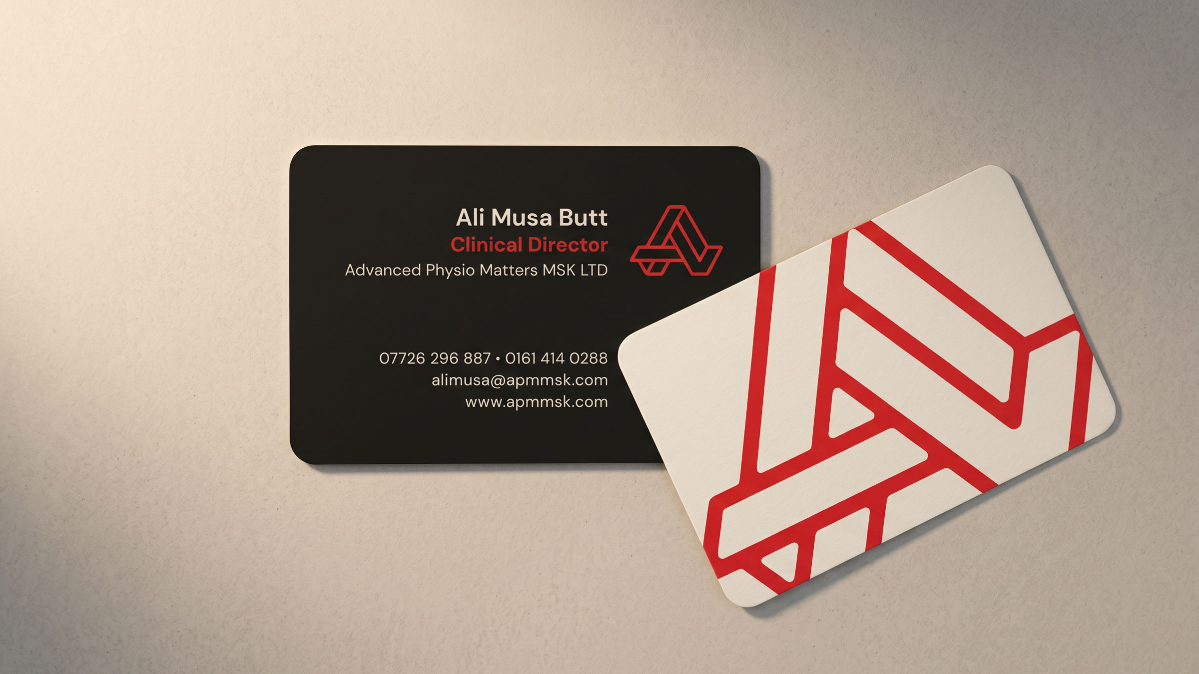
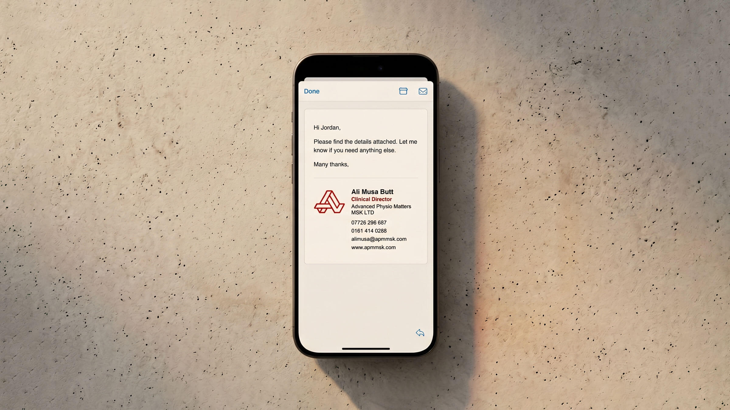
Alongside the logo, I developed a full brand palette and guidelines, business cards and an email footer. A shop sign is currently in production and will be installed soon.
A clean, scalable identity that finally does justice to the original concept — professional, considered and built to work across every format from a business card to a building fascia.